The Quantumrun Foresight Platform helps businesses thrive from emerging trends by providing tools to discover, organize, and visualize insights that will accelerate strategy development, scenario planning, and product ideation initiatives.
One of the key ways the platform provides this value is by allowing premium users to bookmark trend articles into Lists that they can then convert into Projects that visualize the insights from the bookmarked trend articles in ways that can help organizations make better business decisions.
One of the different project types that your organization can find value from is the Scenario Composer.
Quantumrun Foresight’s consultants have found that building business or financial or environmental scenarios helps to improve a company’s preparedness.
And with the Scenario Composer project interface, organizations can visualize the trend content they bookmarked into a circular graph that can segment their List’s trend content using nearly two dozen variables, in hundreds of possible variations.

Project page elements in detail
This support page will detail the various features present in the Scenario Composer project type that your organization can take advantage of for your planning objectives.
Left sidebar
Trend content
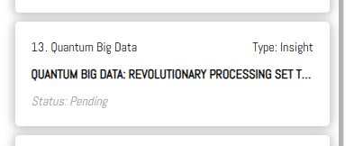
The primary content in this left sidebar will be a scrollable list of all the content your team bookmarked to the List this project page was created with and/or all the content your team custom created using the publishing tools found on this page.
Each row of content will display its: Micro title field (top-left corner); Content type (top-right); Full post title; Status (bottom-left: states include ‘Rated’ or ‘Pending’)
Authoring forms
Your team can publish your own internal or externally sourced website links/URLs or articles/reports by clicking on the black authoring buttons found on the top of the project page’s left sidebar.

After you click either of these buttons, a popup authoring form will appear:
ADD A LINK: Select this option if you want to manually add a website link from inside or outside of Quantumrun.com.
ADD AN ARTICLE: Select this option if you want to manually copy and paste (or even write from scratch!) a note, article, or long-form report that is not otherwise available on Quantumrun.com.
Whichever option you choose, a popup authoring form will appear that will provide you with a list of fields to fill in to publish the above-mentioned types of content into your project page. Note that only those fields with an asterisk are required fields.
After you fill out all of the content creation fields from the Link or Article popups, you will complete the process by clicking on the “PUBLISH” button at the bottom of the forms. The popup will then close, and the new signal or insight post you created will appear on the left sidebar.
Filter options
Clicking on the Filter button will open a popup over the project graph that will display the various options available to filter the left sidebar content list by scoring factors and content tags. In so doing, you will filter the content displayed in the visualization graph on the right portion of the page.
‘Order by’ dropdown: Selecting an option from this dropdown will reorder the content list in the left sidebar using a variety of criteria, including: Rated first (ordering posts by whether they have been voted on by your team); Pending first (posts without votes); Content type; Likelihood (ordering posts with the highest average likelihood values above the ones will lower average values); Impact (ordering posts with the highest average impact values).
Project page visualization
The right portion of the project page features the Scenario Composer visualization. By default, it will (based on the votes collected/applied to each post) automatically position and display the posts inside a circular radar graph.
Using the ‘Filter by’ popup interface, your team can group, divide, and visualize the content listed on the left sidebar across a wide range of categories and scoring criteria.
This visualization interface allows organizations to create a large number of comprehensive business scenarios that can make them ready—prepared—for whatever the market throws at them.
On the top-left corner of the graph:
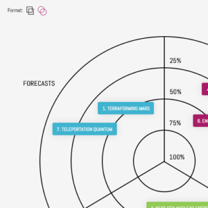
You will see an option to change the format from displaying the left sidebar posts as circles (showing their numbers) or as bars (showing their micro titles).
Meanwhile, on the top-right corner of the graph:
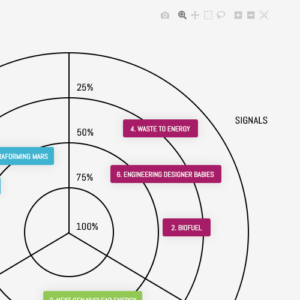
You will see a variety of tools to download a screenshot of your visualization, to zoom in and out, or zoom in on a specific section of the graph, and to reset the graph to its original dimensions. More tools may be added based on user feedback.
Project page menu
Above the project page elements described above:
 You will see the project page’s title, as well as several buttons:
- The EXPORT button will download an excel spreadsheet of all the metadata from your project.
- The REFRESH button will reload the page.
- The TUTORIALS dropdown contains direct links to relevant training articles.
- The “SETTINGS” button that will allow you to edit various project page settings. Read more here.