The Quantumrun Foresight Platform helps businesses thrive from emerging trends by providing tools to discover, organize, and visualize insights that will accelerate strategy development, scenario planning, and product ideation initiatives.
One of the key ways the platform provides this value is by allowing premium users to bookmark trend articles into Lists that they can then convert into Projects that visualize the insights from the bookmarked trend articles in ways that can help organizations make better business decisions.
One of the different project types that your organization can find value from is the Scenario Composer.
Quantumrun Foresight’s consultants have found that building business or financial or environmental scenarios helps to improve a company’s preparedness.
With the Scenario Composer project interface, organizations can visualize the trend content they bookmarked into a circular graph that can segment their List’s trend content using nearly two dozen variables, in hundreds of possible variations.

Scenario Composer methodology
The Scenario Composer project interface is designed to augment and enhance your organization’s existing strategy development practices. To better understand the theory and methodology behind traditional business scenario development and how the Scenario Composer project interface can build upon this methodology, please click here.
Getting started
The following usage overview assumes that your team is familiar with the various features of the standard Scenario Composer project interface, as described in this overview.
Step 1
The first step when using the Scenario Composer is simply to create one. You can start a project from scratch, as explained here. Or you can start a project based on content curated in one of your lists, as explained here.
Step 2
Once your project page is created, it is important to fill your project page with trend content or other forms of data. This content will appear on the left sidebar of the project page and will be used by the platform to populate the graph visualization on the right portion of the project page.
Again, you can accelerate this process by creating a project that references a previously created list populated with curated trend content. However, there are many scenarios where an organization may instead want to populate this project exclusively with content or insights that are internal to the organization (i.e. not available to other platform users).
In the latter scenario, organizations can publish their own content (in article form) by using the dropdown options found under the “+PROJECT CONTENT” button. Read details here.
Step 3
From this point, an important element to understand is how are the trend posts distributed on the graph.
Very simply, every post on the Quantumrun Foresight Platform includes three variables that readers can vote on:
- What year they think the forecast or trend will begin affecting industry, or the world.
- The likelihood that the forecast or trend will become a reality.
- And its impact on industry or the world.

The averaged vote scores from all these readers determine the position of each given trend post on the project page graph.
However, for many teams, the averaged votes from the platform’s users may not align with perspectives or realities from inside their respective organizations. In this scenario, Quantumrun recommends deactivating the toggle found at the top of your project’s left sidebar.
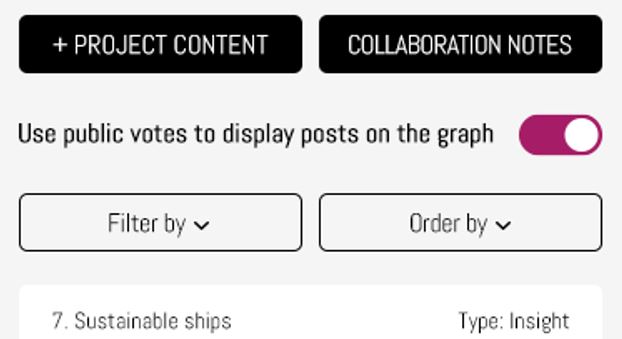
By deactivating this toggle, the project page will switch from presenting the posts using the platform’s collective votes to only presenting the posts using your team’s averaged votes.
Initially, this will mean that your team’s project page will appear empty. To fill it up again, your team needs to start opening each of the posts listed in the left sidebar.
Rating left sidebar content
As you scroll down, you will find a ranking box where members of your team, who have been given editing access to this project, can take turns ranking trend content according to the following categories:
- What year they think the forecast or trend will begin affecting industry, or the world, or your specific organization.
- The likelihood that the forecast or trend will become a reality.
- And its impact on industry or its relevance to your organization.
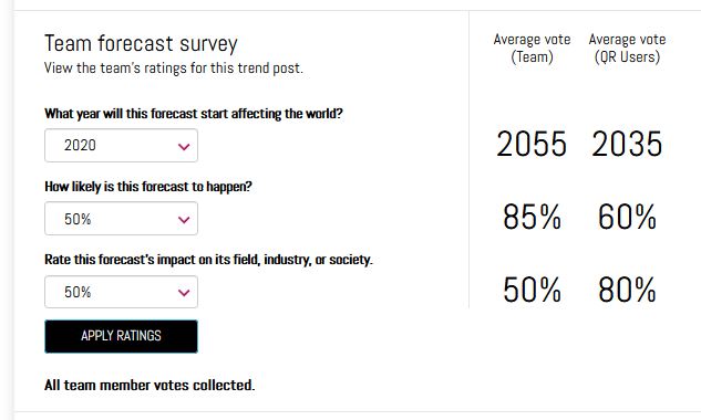
Each team member will be able to view the team’s averaged vote score after they press the apply ratings button.
The second column will display the averaged vote score collected from all registered platform users, outside of your organization, who have access to the selected post.
Many organizations find this voting interface useful because it allows them to conduct anonymous team voting on various topics.
It also allows them to compare their team’s votes against the collective wisdom of the crowd. Large differences between the two columns can lead to qualitative insights about how a given trend should be assessed or can indicate areas for additional research.
Finally, below the apply ratings button, will be a list of team members whose votes are still pending.
Important note: After each vote by a team member, the average vote score will change, meaning that the trend post being voted on will appear to change position on the graph after each person adds their vote. However, each post will settle on a final position after all team members contribute their votes.
Overall, depending on the size of your team and the number of trend posts listed in your project’s left sidebar, this initial team collaboration or voting exercise can take thirty to sixty minutes, on average. If you are using a project page by yourself, the voting process can be much faster.
Step 4
Once your team rates most-to-all of the content on the left sidebar, you will find the graph visualization filled with trend insights that are positioned on the circular graph in a manner that reflects your team’s vote-averaged perception of each trend insight.
Using the ‘Filter by’ popup interface on the left sidebar, your team can group, divide, and visualize the content listed on the left sidebar across a wide range of categories and voting criteria.
The interactive buttons at the top of the graph will allow you to zoom in and out of the visualization in a variety of ways.
Step 5
At this stage, how your team interprets the results of this visualization will be unique to how your organization interprets insights and data. It will also be influenced by who leads/facilitates the meetings or workshops around this platform.
This platform facilitates the discovery and curation of trend insights and the Scenario Composer project interface facilitates accelerated group interpretation of these trend insights to create a large number of comprehensive business scenarios that can make your organization ready—prepared—for whatever the market throws at it.
Schedule a free consultation with a Quantumrun Foresight representative to improve your use of the Scenario Composer project interface. Click here.